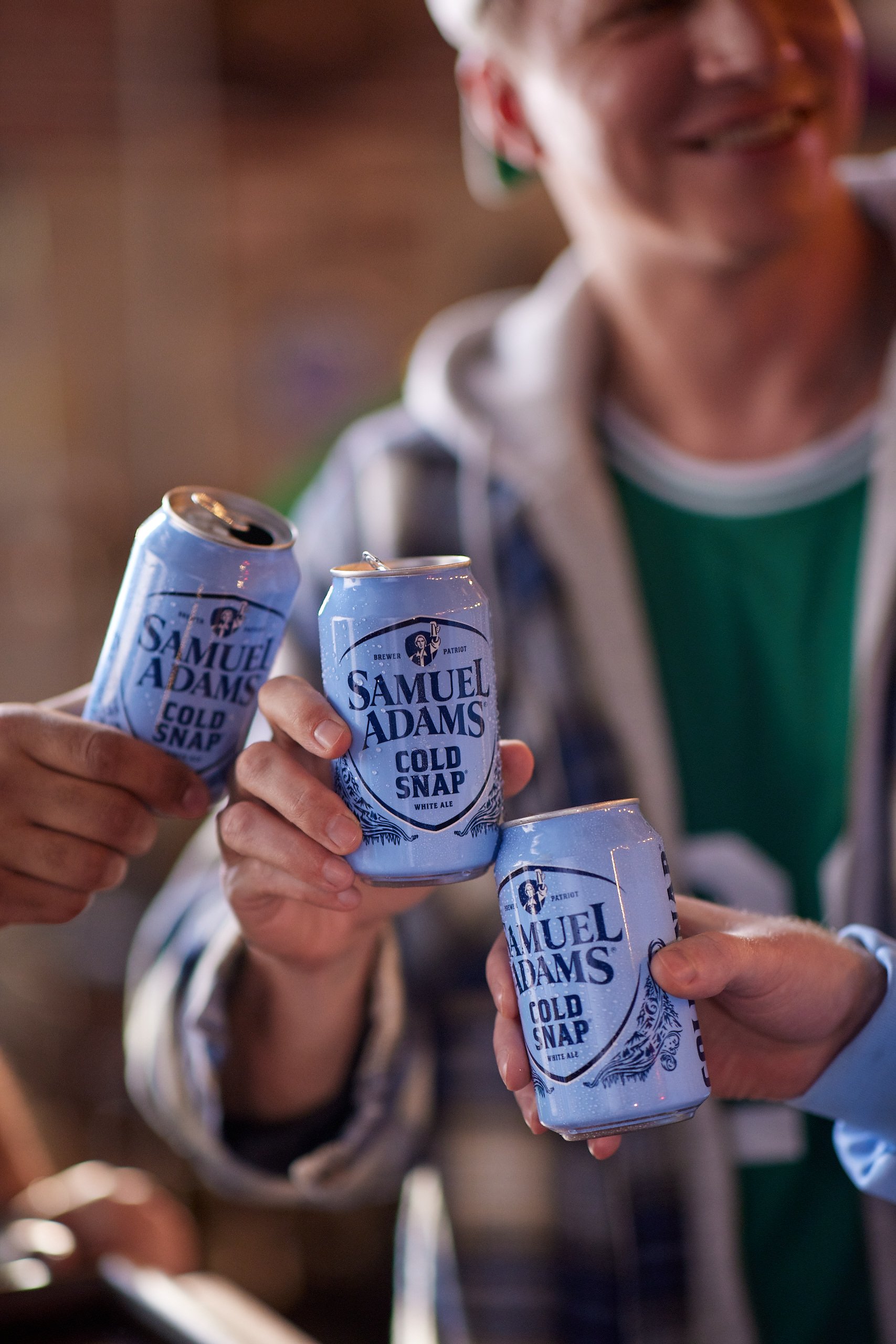
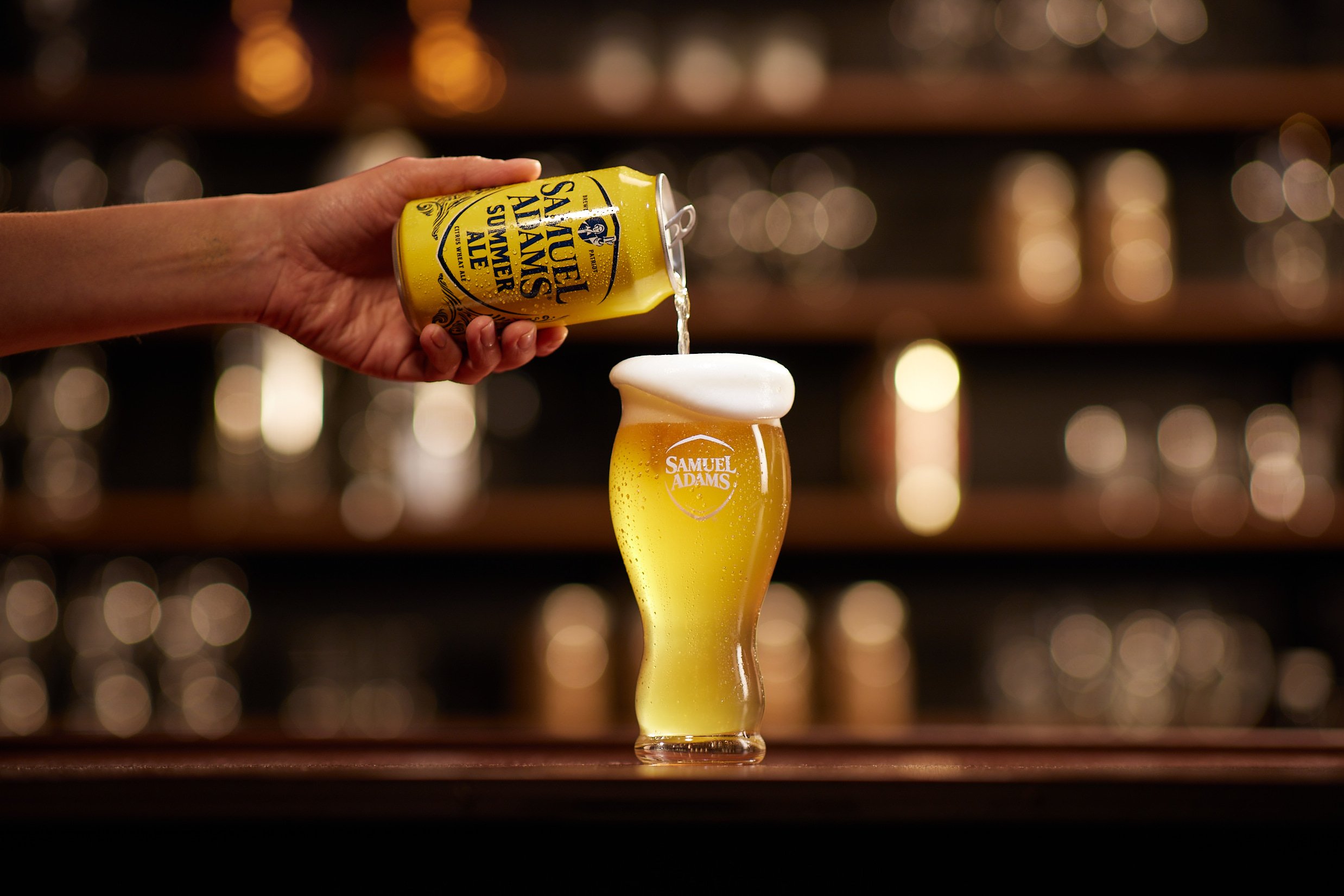
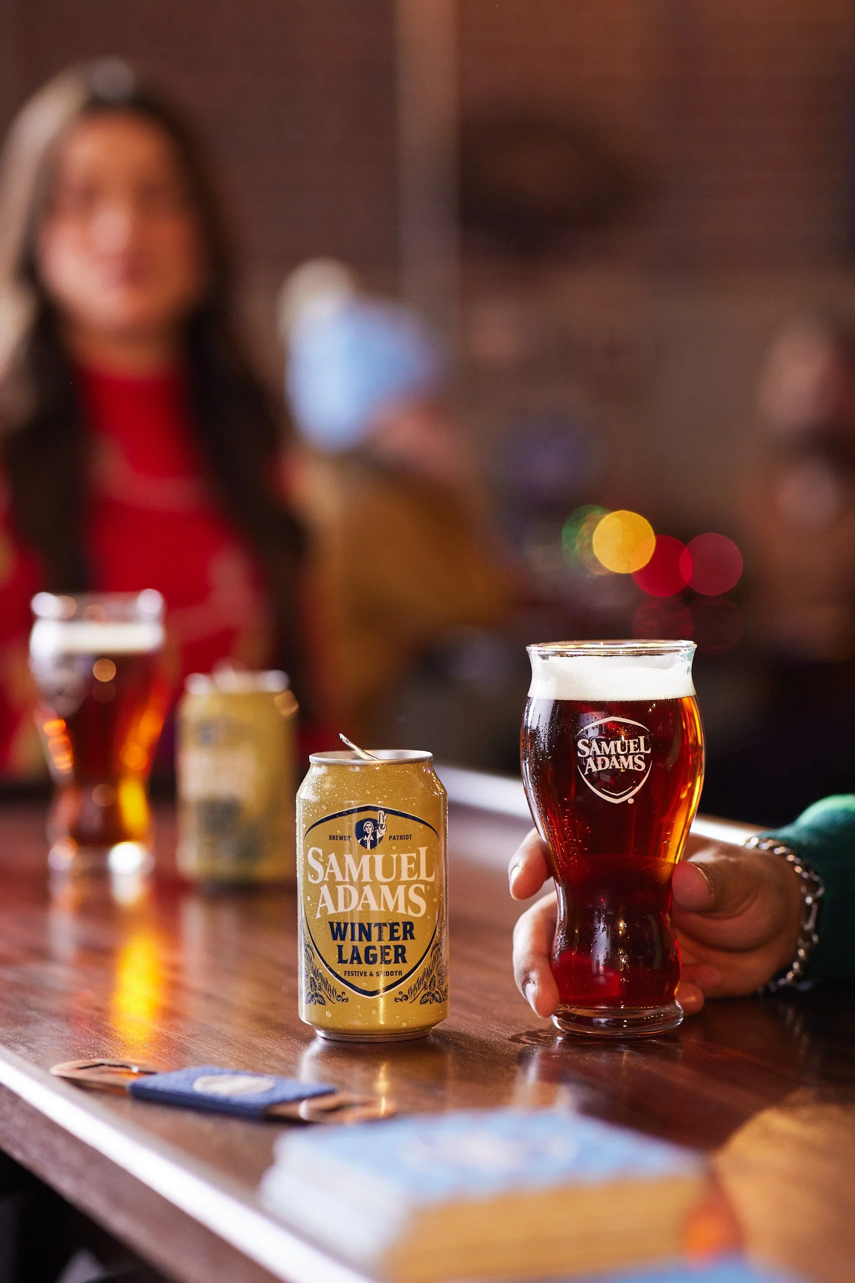
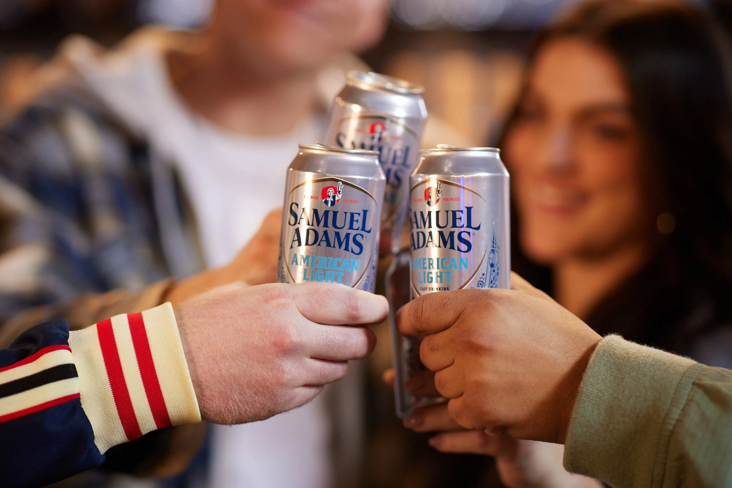
Samuel Adams
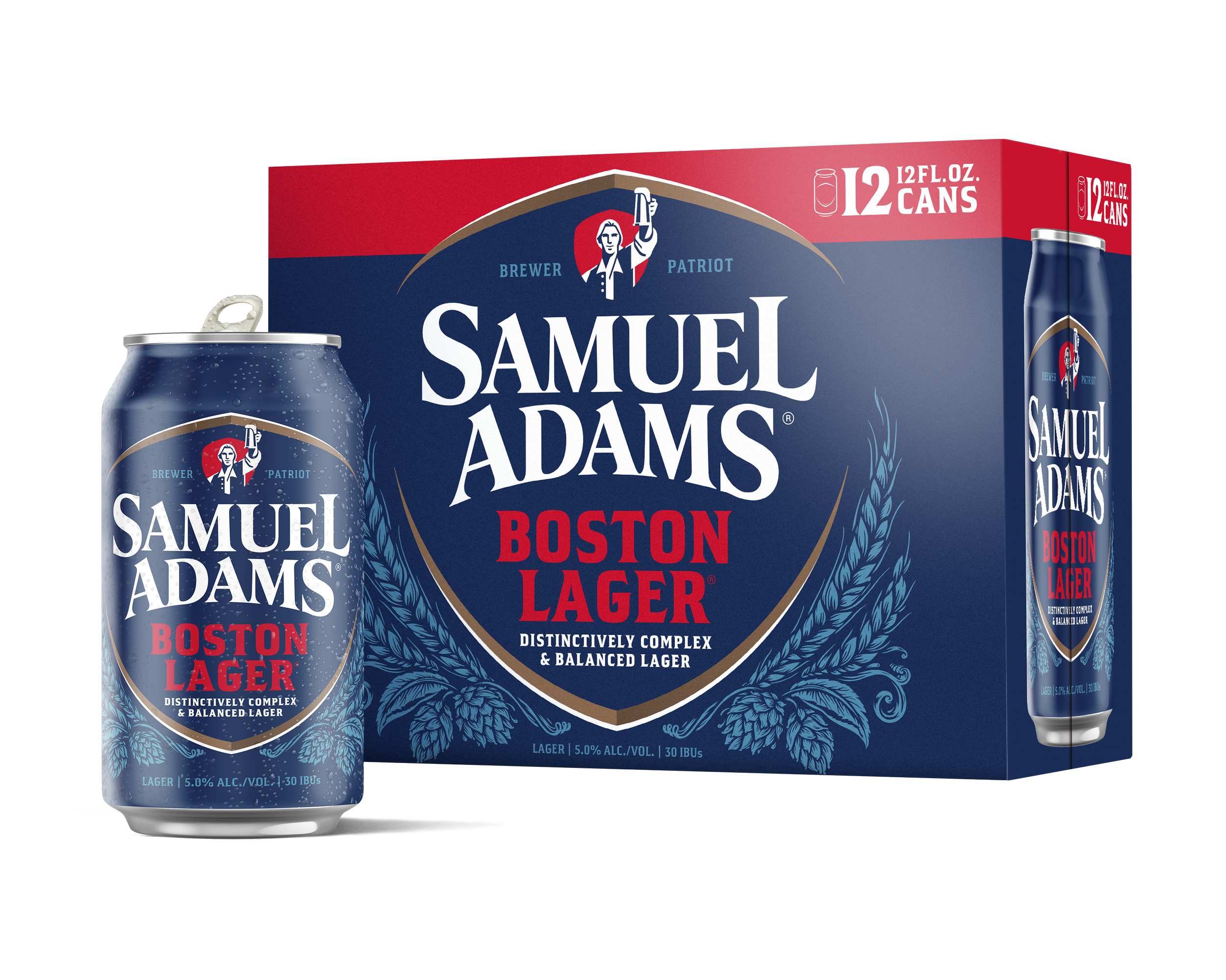
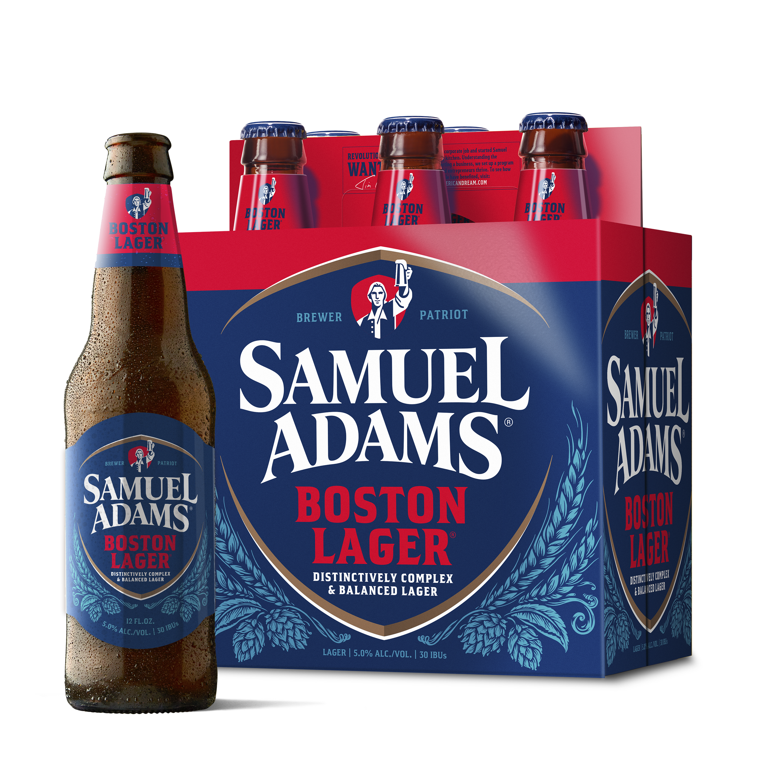
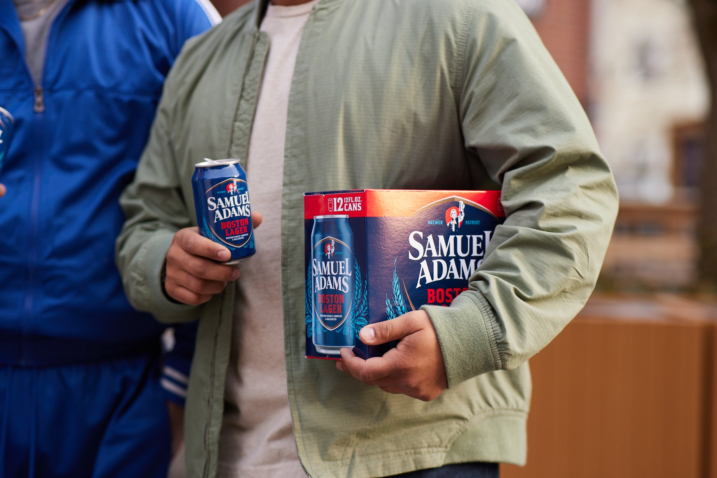
Simple, authentic, and timeless—that's what we're all about. We wanted to freshen up the Samuel Adams brand with a confident, modern vibe that ties together all the different styles we offer, creating a cohesive look. Sam Adams is for those who appreciate the little things in life—the kind of things that are made well and last for a long time. It’s about finding quality stuff and steering clear of pretentious folks who wouldn’t lift a finger. This redesign really aims to capture that laid-back, genuine attitude.
What I did:
Brand Strategy
Positioning
Creative Direction
Packaging Concept & Design
Photography Direction
Agency Management


We embarked on a journey to transform the Samuel Adams graphic, infusing it with modernity and a renewed sense of confidence. Our vision was to depict him boldly raising the beer glass toward the consumer, inspiring and uplifting. We refined the packaging graphics by cleaning up and simplifying the brand message, creating a commanding presence on the shelf. Additionally, we began developing a striking illusion style based on this clean, modern aesthetic to elevate the brand into a straightforward, bold visual communication system.